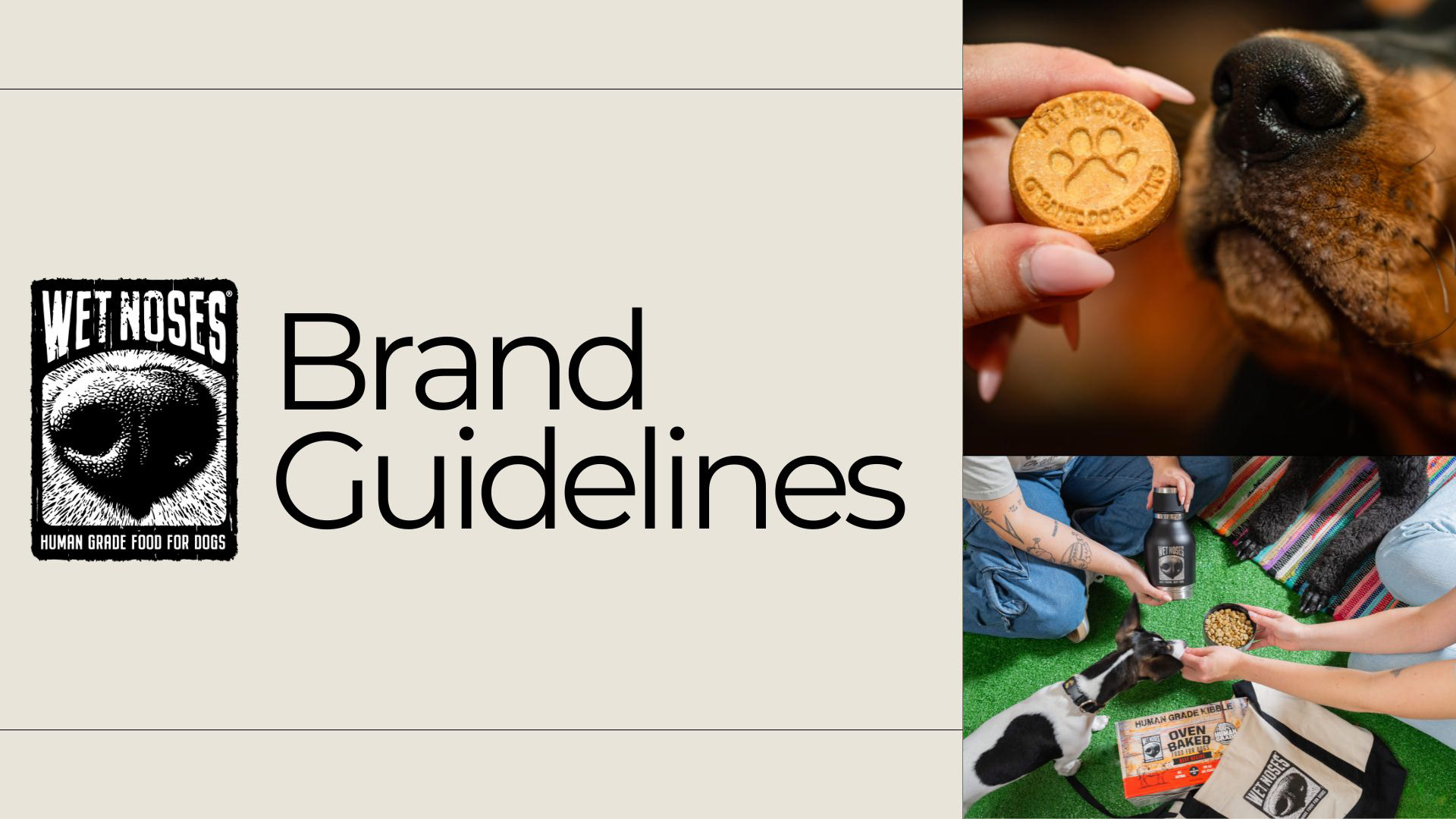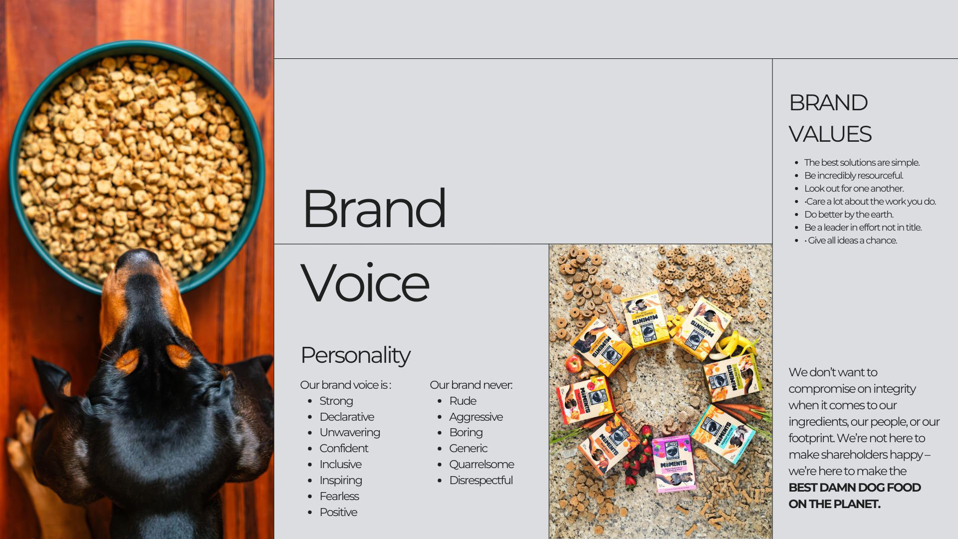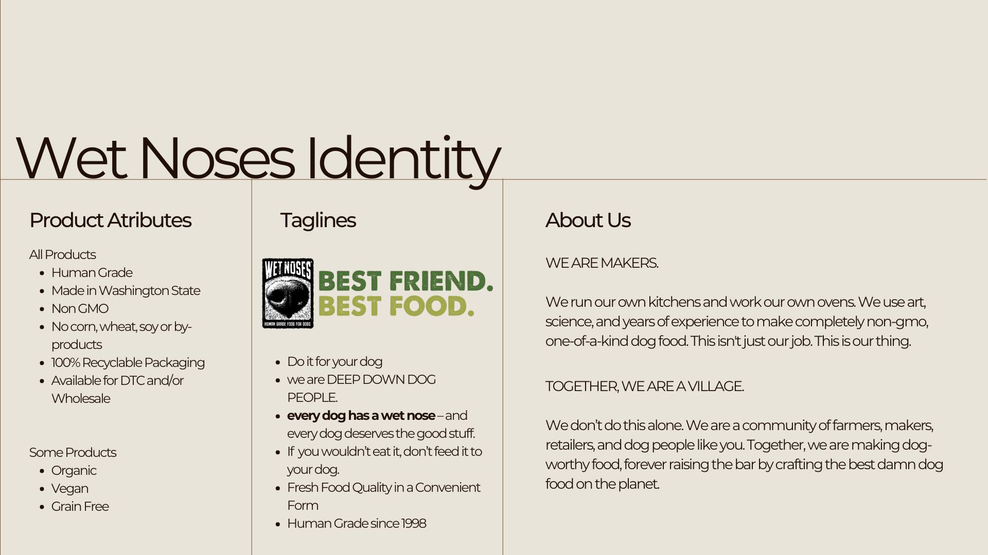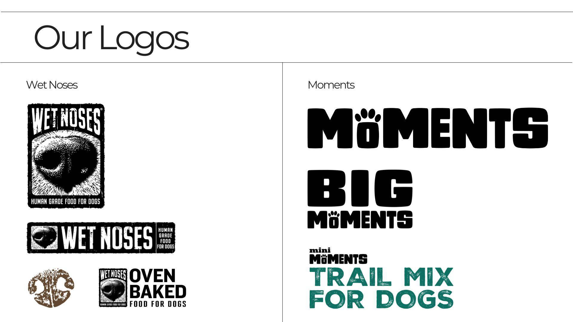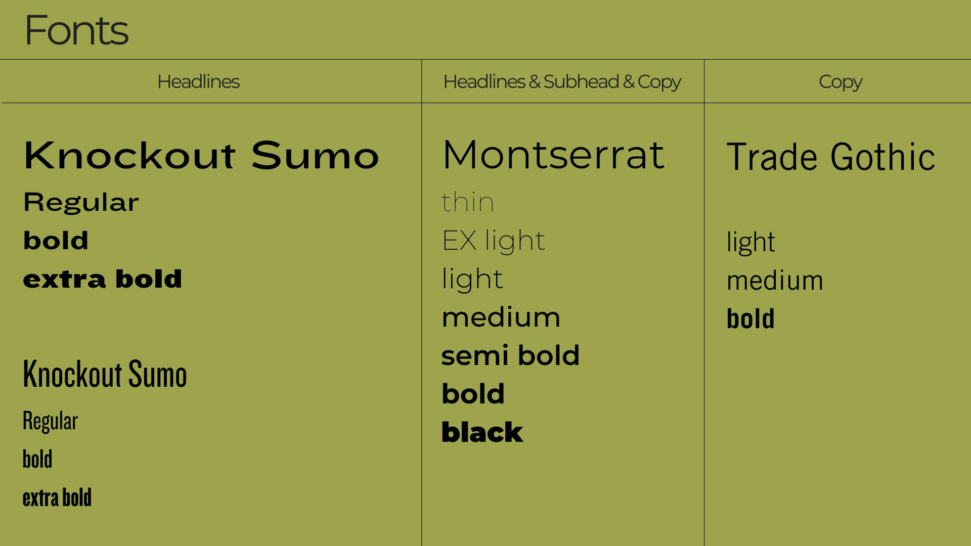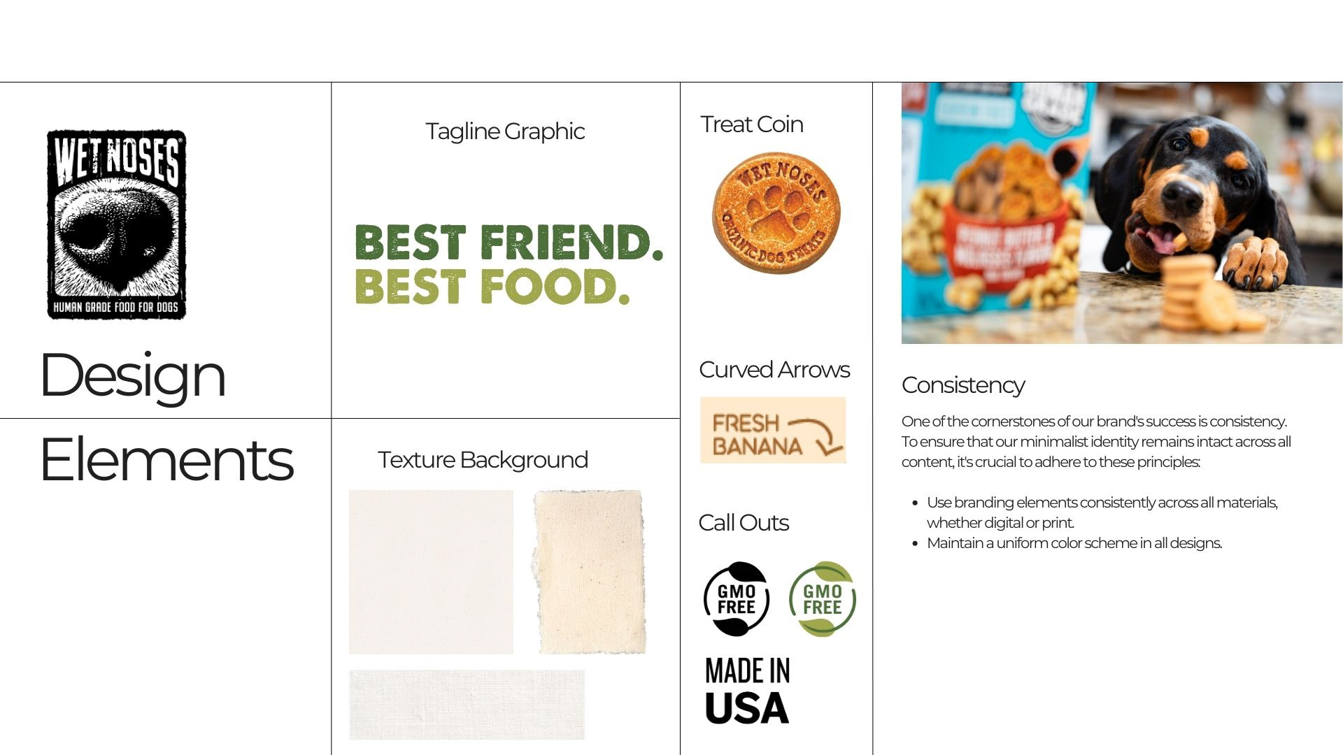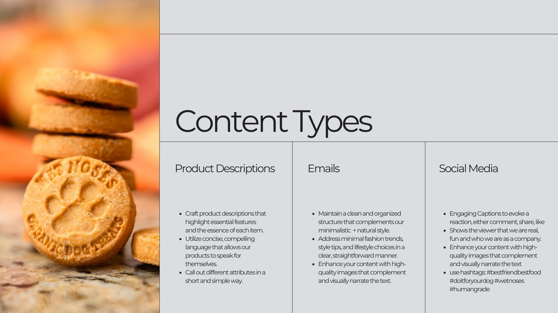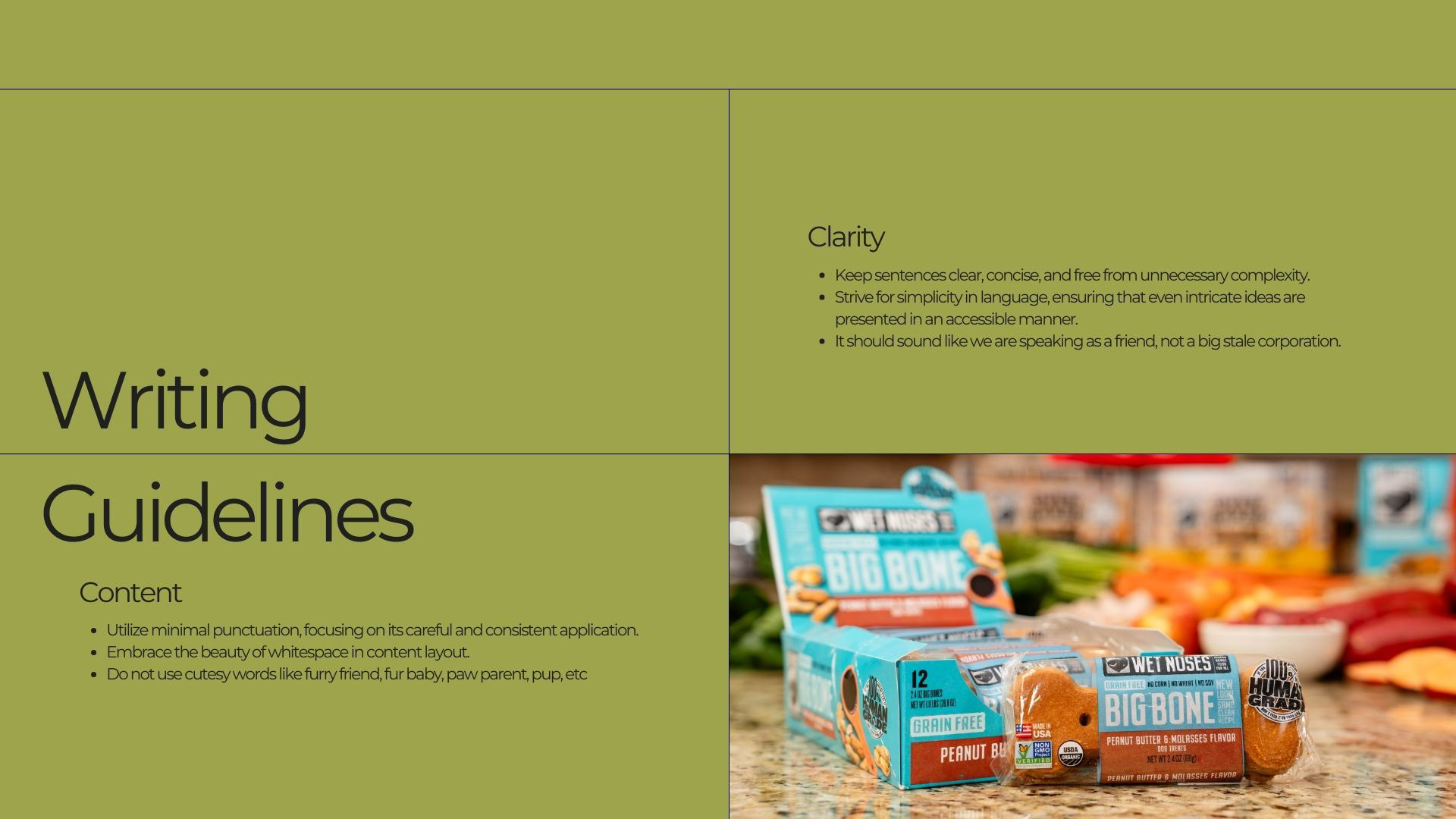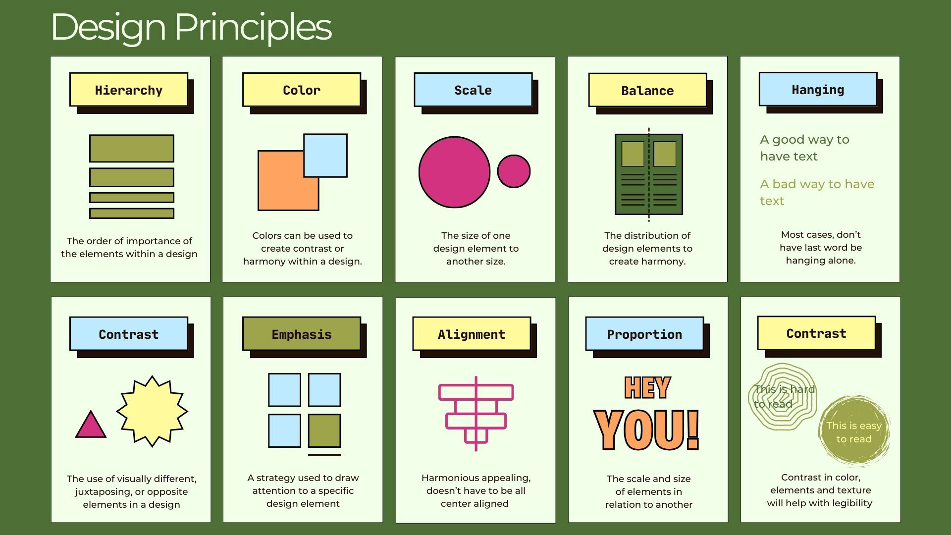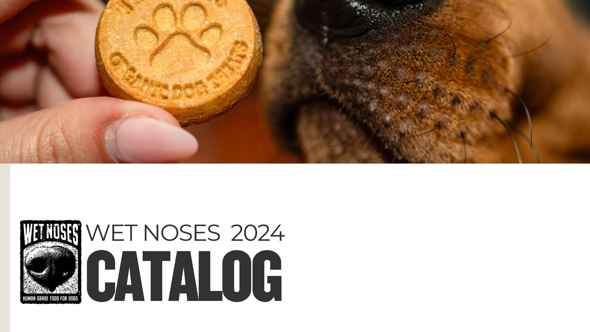
Creating the Wet Noses brand guide was an exciting journey! I focused on capturing the essence of our brand—high quality, strong and inclusive. The guide outlines our brand voice, typography, logo usage, and overall aesthetic to ensure consistency across all platforms.
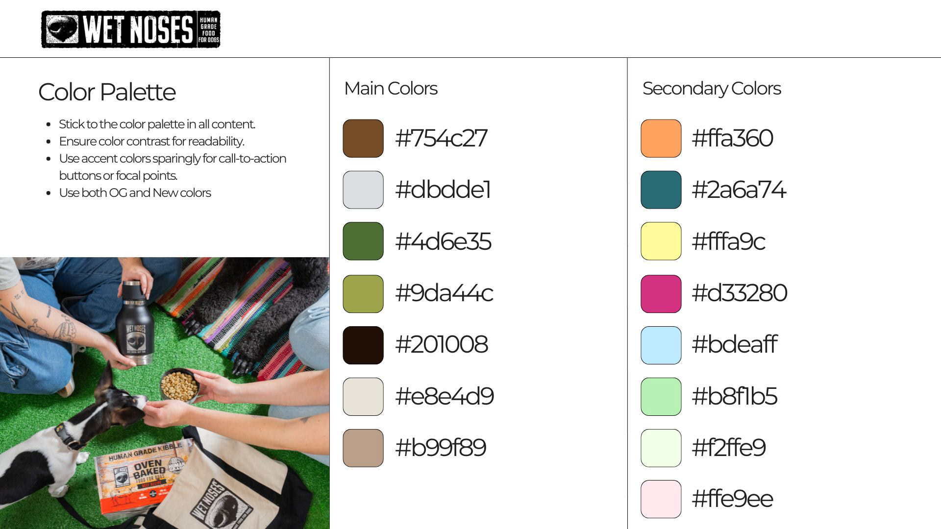
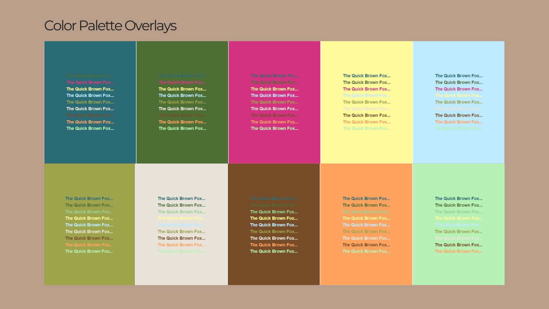
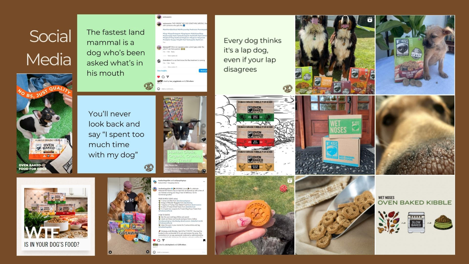
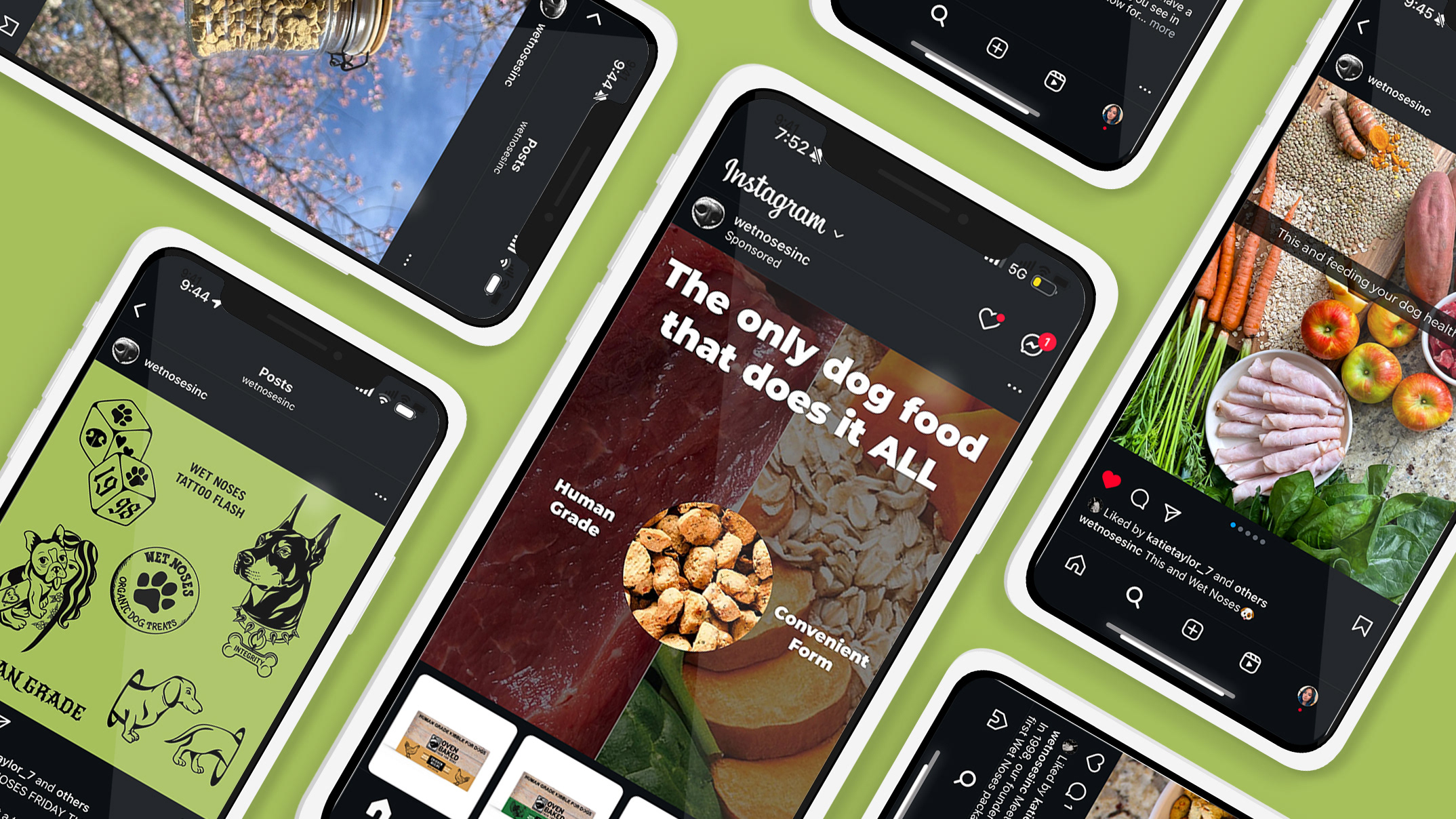
To enhance our digital presence, I’m thrilled to have introduced a new complementary color palette designed specifically for digital media. This palette features vibrant hues that not only catch the eye but also resonate well with our target audience. The colors are strategically chosen to evoke emotions and create a sense of connection, making our posts more engaging and shareable.
Incorporating this palette into our graphics and posts will help us stand out in feeds and drive better engagement. I’m excited to see that these changes elevate our digital content and reinforce the Wet Noses brand!
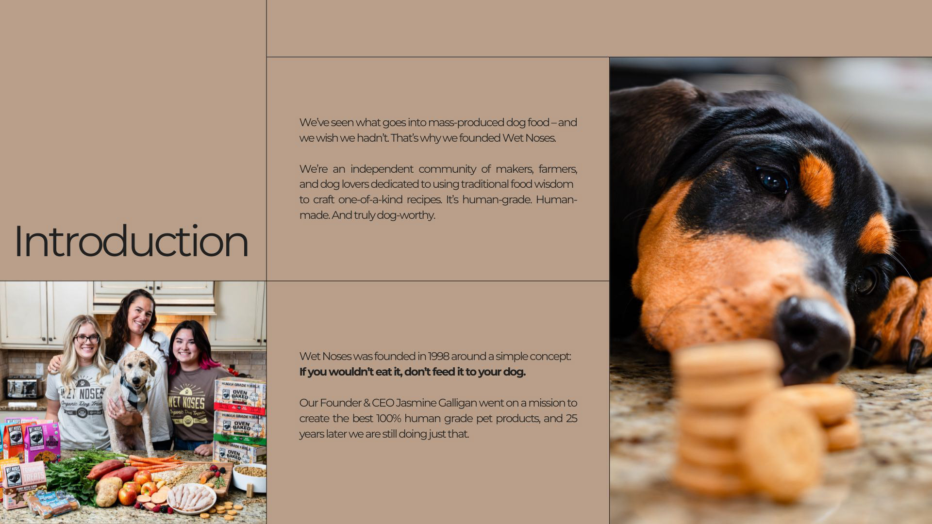
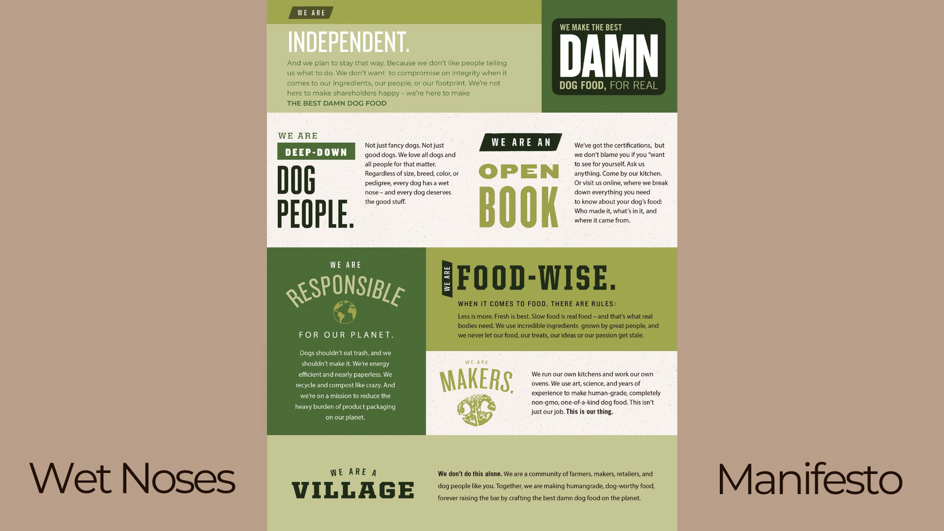
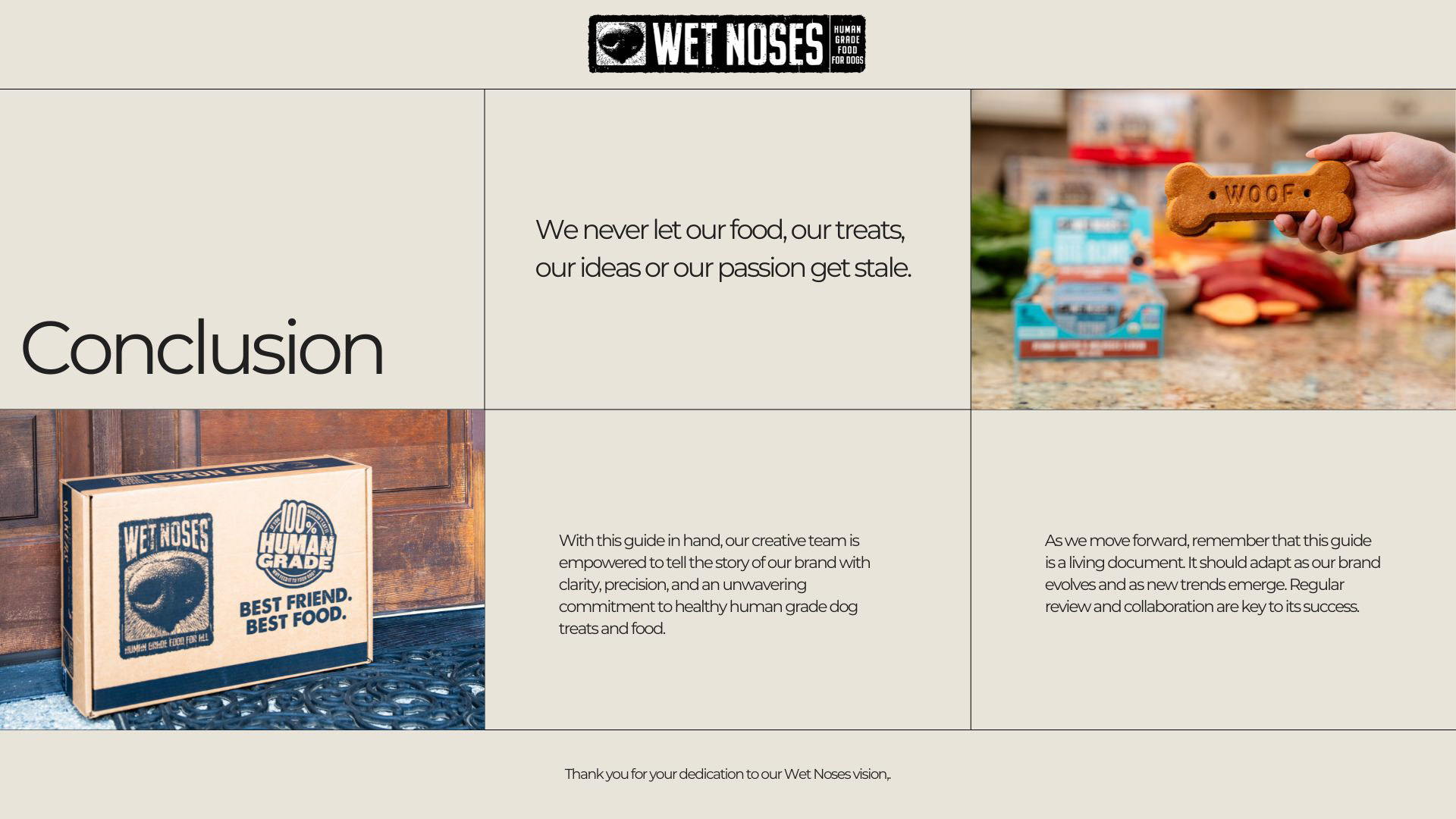
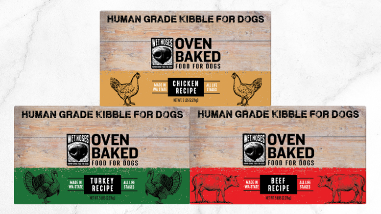
Everything you see here are assets I have created. From creating their logos and design elements to the manifesto to elevating their colors and fonts.