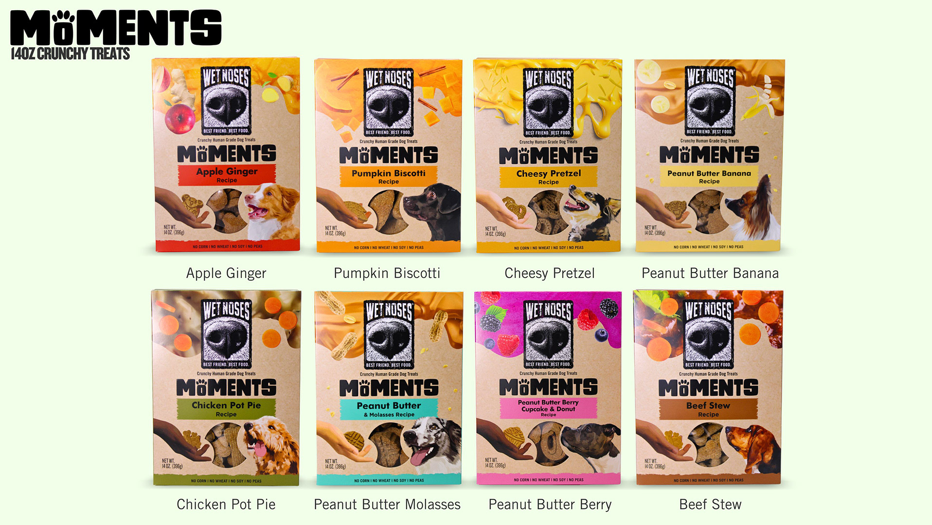
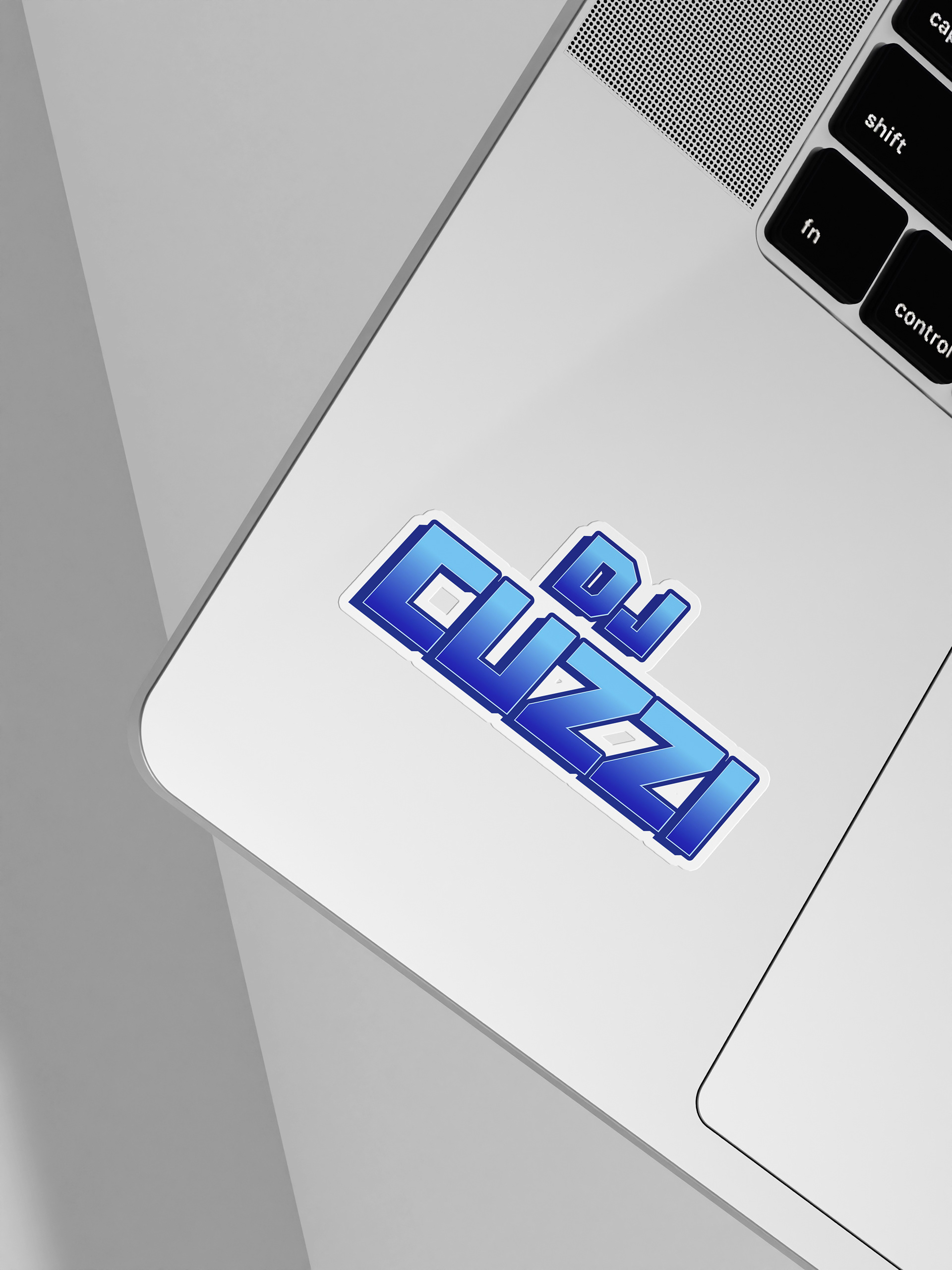
DJ Cuzzi wanted a bold wordmark logo that would stand out across digital platforms and promotional graphics. The direction was clear from the start: a blue color palette and strong 3D lettering that captures the energy of a live DJ set. I designed a custom wordmark that uses dimensional typography to create movement, depth, and a vibrant stage-ready feel.

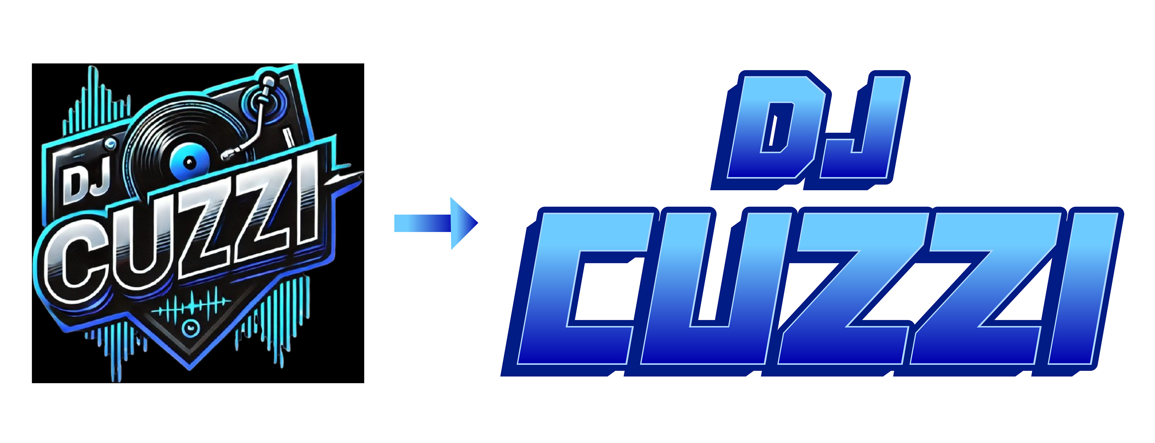
The original logo featured a DJ turntable placed on a solid black square background. While it clearly referenced music, the design was visually heavy and difficult to use across different branding applications. In the redesign, I created a bold 3D wordmark using blue gradients to add depth and dimension. The new logo is more flexible, modern, and scalable, making it easier to use across digital graphics, social media, and promotional materials while still capturing the energy of DJ Cuzzi’s brand.
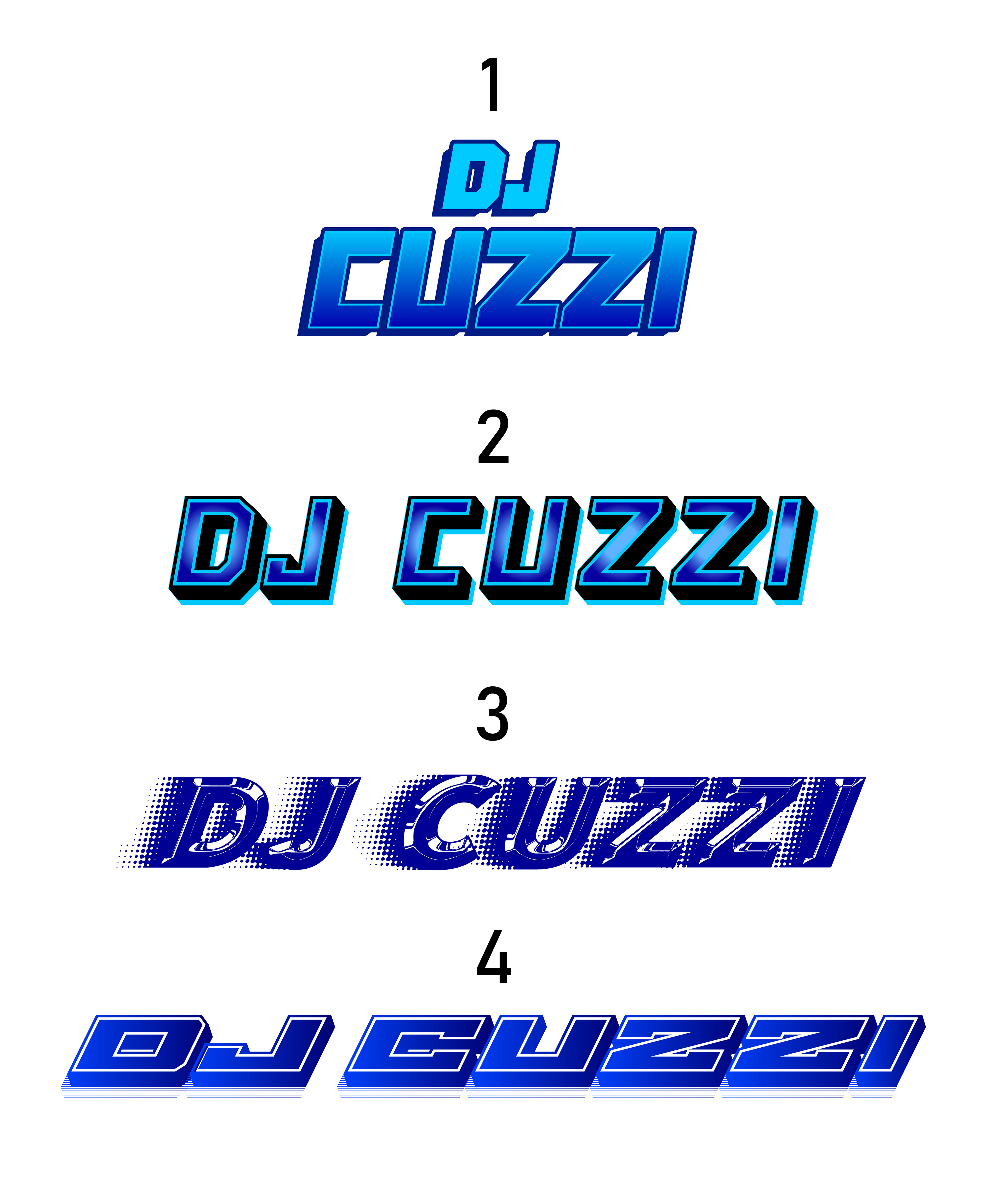
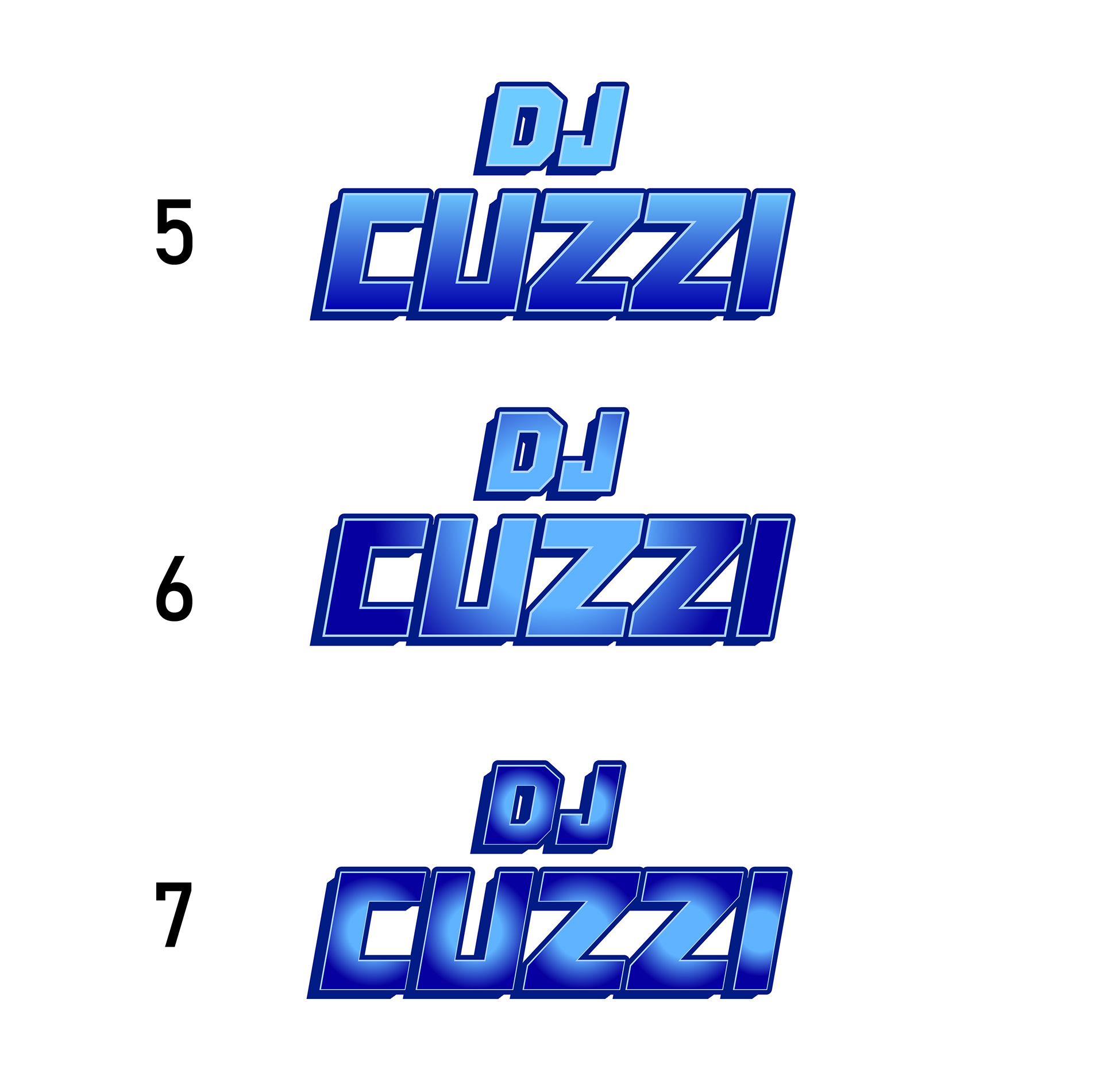
These early directions allowed us to see how different styles, depth, and lettering treatments could represent the DJ Cuzzi name. Concept 1 stood out right away and resonated the most with him. From there, I refined and expanded on that direction by enhancing the 3D effect, adjusting the gradients, and strengthening the overall wordmark until we landed on the final logo that captured exactly the look and energy he wanted.